Industry take · 4 min read
Apple Music dropped red. What replaces it?
On 21 October 2026 Apple unveiled a new identity for Apple Music: a black-and-white logo and icon, a heavier wordmark and a sonic identity, in place of the red the service was known for. The question for every other brand is what carries recognition when the obvious thing is gone.
 Mike Bruce · Brand Growth Architect
23 October 2026
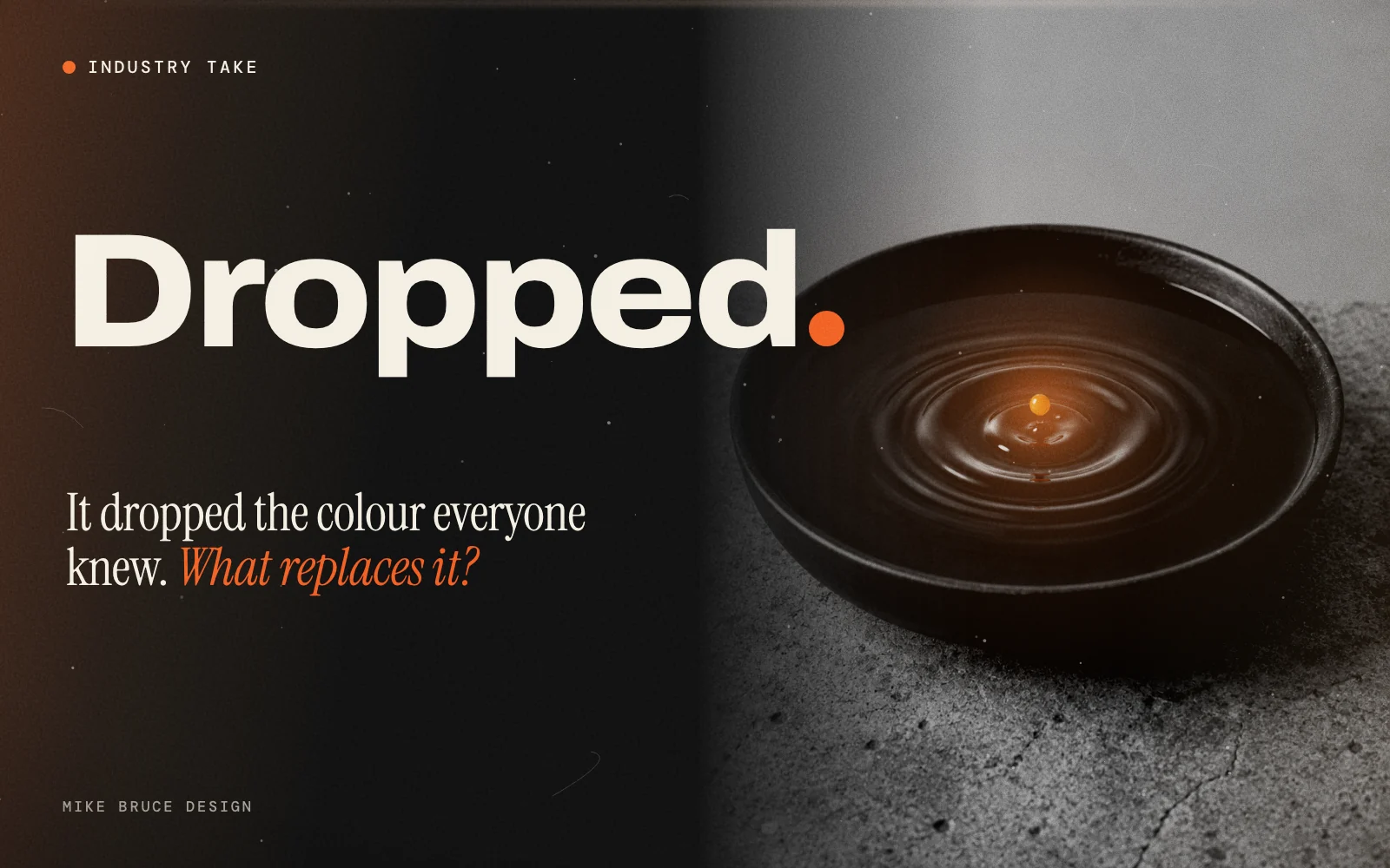
On 21 October 2026 Apple announced a new identity for Apple Music. The red colour scheme is gone. In its place are a black-and-white logo and app icon, a new heavier wordmark and a sonic identity. Apple says the look was "made by sound". The change rolls out with iOS 27.2 and macOS 27.2. MacRumors has the timeline: the logo was first spotted in betas in early October and the icon changed around 13 October.
What are people saying?
Reaction is mixed. Several tech outlets covered the sound-made visuals as the story. At least one outlet reports that some users find the black-and-white version less distinctive than the red one. It is early, and Apple has not said whether colour will return to the icon.
Details differ between reports on how the visuals were made, so I will stay with what Apple itself says: they were "made by sound". The coverage is gathered in The Branding Update and Yahoo Tech.
The same newsletter points to a Design Week argument, by designer Bud Rodecker, that reactionary rebrands throw away years of built-up brand equity, and that brand design now feels disposable. That is the background to this launch.
My take
Red was how you knew it was Apple Music from across a room. In the language of the Aldine Press, it was the mark. Giving up your most recognisable cue is a bold move, and it only works if recognition moves somewhere else.
I read this as a bet that sound is now the most ownable asset a music brand has. A colour can be copied by anyone with a paint chart. A sonic signature is harder to copy. That is a sensible bet for a service that people hear far more than they look at.
That is opinion, and the proof will be in recognition, not in how the launch video feels. Apple can afford the experiment because it has the reach to teach millions of people a new cue quickly.
You can retire what people recognise only as fast as you can teach them what replaces it.
What should you do about it?
Most founders do not have Apple's reach, so the lesson is the opposite. Before you change how your brand looks, run three checks.
- What do people recognise you by today? Ask ten customers to describe you without your name. If they say a colour, a phrase or a person, that is your equity. Do not retire it by accident.
- What replaces it, and where does it appear first? A new cue needs to show up everywhere the old one did, on the same day. A launch that reaches only the website leaves the rest of the market looking at the old brand.
- How will you measure recognition afterwards? Track how many people name you unprompted and how many search for you by name, before and after. If neither moves, the change did not earn its cost.
This is the Clarify and Construct work in the Brand Growth OS™: settle what you are known for, then build the identity that carries it. If you are not sure what that is, the Differentiation Audit is a fast place to start, and the Brand Growth Audit™ scores every phase. I also wrote about why certainty is the brand.
Sources
MacRumors, 21 October 2026 · Yahoo Tech · The Branding Update, 22 October 2026. Opinion in this piece is Mike Bruce's. See all brand voices · About Mike Bruce.
Keep reading