Industry take · 5 min read
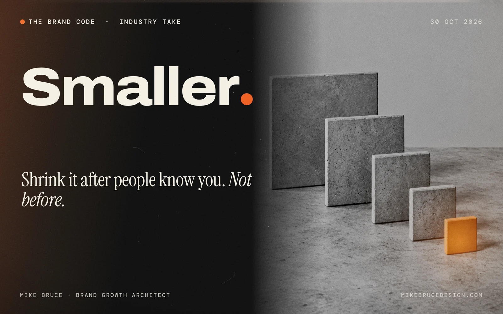
Visa shrank its mark to one letter. Could you?
On 21 October 2026 Visa introduced a standalone V symbol and a custom typeface, Visa Sans, as part of a visual identity refresh. Visa says the new system is built for smaller screens and AI-enabled shopping. It is still being discussed in this week's branding roundups, and it poses a useful test for any brand.
 Mike Bruce · Brand Growth Architect
30 October 2026
On 21 October 2026 Visa introduced a standalone V symbol and a custom typeface, Visa Sans. According to ContentGrip's report, the update also covers typography, imagery, illustration, motion and digital design. The Visa name and wordmark stay. The V takes over from the blue, white and yellow flag-like graphic from Visa's 2021 brand evolution. Visa's in-house studio worked with Base Design for roughly a year, the report says.
Why did Visa do it?
Visa says people now find, research and pay for products across more fragmented channels: creators, apps, stores and online. It positions the new system for smaller digital screens and for AI-enabled and agentic commerce, where, it says, recognisable brand cues will matter. Frank Cooper III, Visa's chief marketing officer, said the refresh was meant to feel fresh for the next generation.
What are people saying?
It featured in The Branding Update's 22 to 28 October roundup alongside the Interbrand rankings, and design outlets covered it through the week. ContentGrip raises the open question: the sources establish design intent, not measured changes in recognition, trust or payment behaviour, and a single letter asks people to recognise more from less.
My take
This is opinion. The idea is sound: if your mark only works when it is big, with your name beside it, it will fail where most people will meet you. Phone screens and AI-assisted checkout shrink everything.
It also connects to the Apple Music story I wrote about earlier this month. In both cases a famous brand is moving recognition away from a decoration and towards something that survives small, fast and machine-read contexts. Colour in one case, a single letter in the other.
The caution for a smaller business is that Visa can do this because it has global scale and billions of impressions to teach people the new mark. A founder has to earn that recognition first, then shrink.
Shrink your brand only after people know it. Before that, shrinking just makes it harder to find.
Three tests you can run this week
- The icon test. Put your mark at app-icon size, in black and white, with no name beside it. Show it to five people who know you and five who do not, and ask who it is.
- The sentence test. Ask an AI assistant to describe your brand in one line. If it is wrong or vague, your small signals are not doing their job.
- The first-three-seconds test. Look at your profile or search result as a stranger would. What tells them who you are before they read anything?
This is the Construct and Connect work in the Brand Growth OS™: build the identity so it carries, then make sure it travels. The AI Visibility Check covers the second test, the Brand Guidelines Template helps you write down the small-size rules, and my take on AI assistants disagreeing about your brand goes further.
Sources
ContentGrip · The Branding Update, 28 October 2026. I have not seen Visa's own press release. Opinion in this piece is Mike Bruce's. See all brand voices · About Mike Bruce.
Keep reading